A Whole New Look

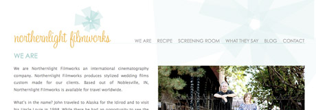
Northernlight Filmworks approached me many months back with one goal in mind: To rebrand their entire look so that it better reflected their business and personality. A major part of this process was developing the new logo. Next, it was time to redesign their site, using the same ideas that went into designing the logo.
The old site had a dark color scheme, including a black background, which didn’t reflect the personality and style of Northernlight Filmworks. It also had no content management system in place to allow the client to make updates to the content. The separate, generic blog didn’t allow them to post larger videos, which was unfortunate because their work is breathtaking and direct proof of their talent and expertise.
The new site’s overall design now has a much lighter feel and makes positive use of white space. It is a combination of a web site and blog, both of which can be updated by the client using WordPress. The wider blog allows them to post their videos at a size that is 25% larger than their previous blog.
See the new look for yourself at the freshly launched Northernlight Filmworks site.
October 29, 2009 | Link to this post
Recent Posts
- Be Our Guest
- Sunshine & Snowstorms
- Looking Back on 2011
- 2010 Looking Back: Taking care of Business
- 2010 Looking Back: California Dreaming
- 2010 Looking Back: It Starts at Home
- 2010 Looking Back
- Here, There & Everywhere
- Stars and Open Bars
- Raining cats and dogs
- Windy City Weekend
- Baja and Bulldogs
- MORE POSTS


